1RegretBeetle
REAL RACING ROOTS '99 - Ridge Racer R(ap)4
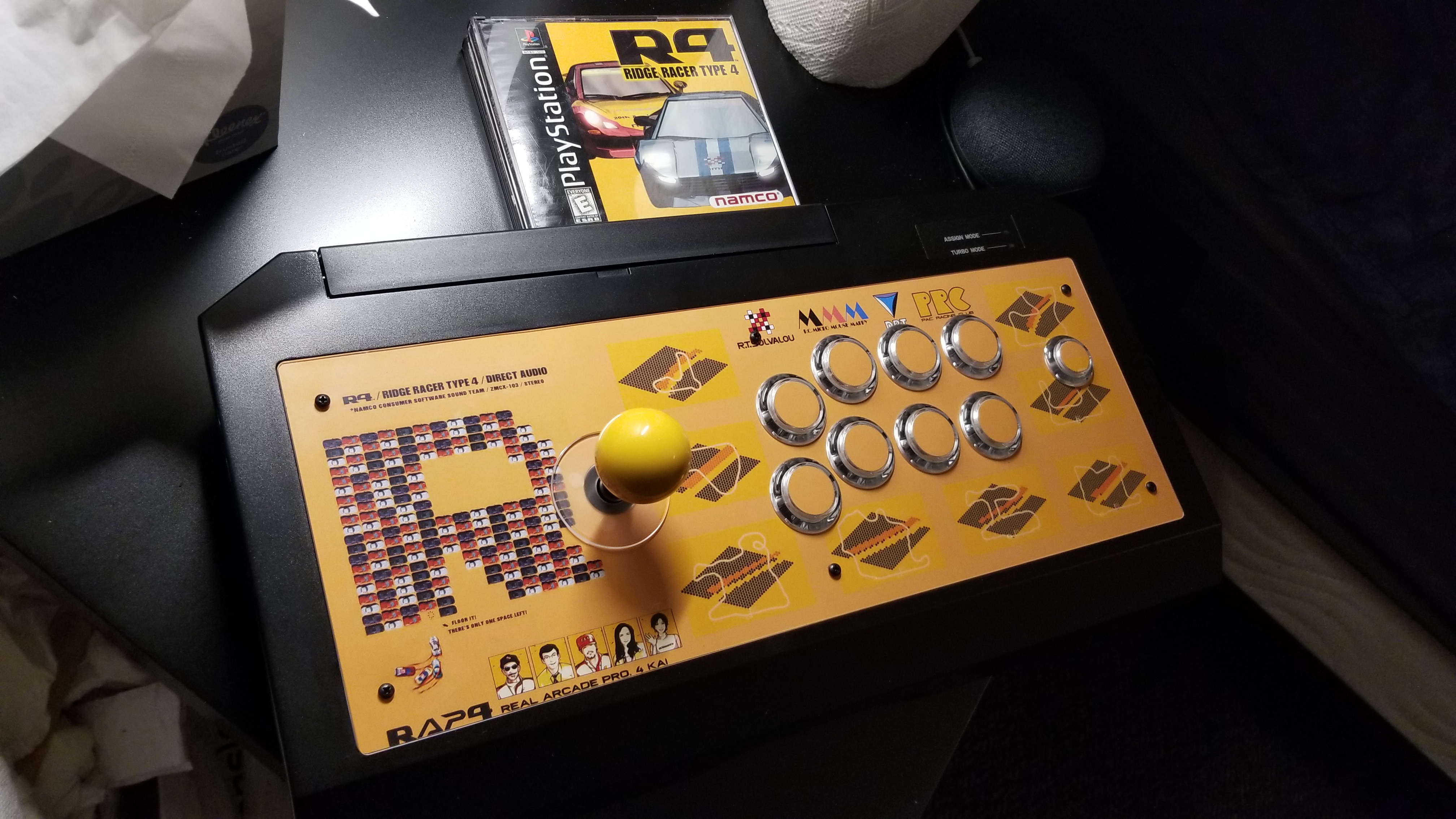
A few years ago, I decided to modify my stock Hori RAP4 with new parts, since the stock Hayabusa buttons were a bit low and sensitive for my taste. I figured that, while I was at it, I would go ahead and redo its appearance with an idea that I have been toying with for a while.
It started with this image:
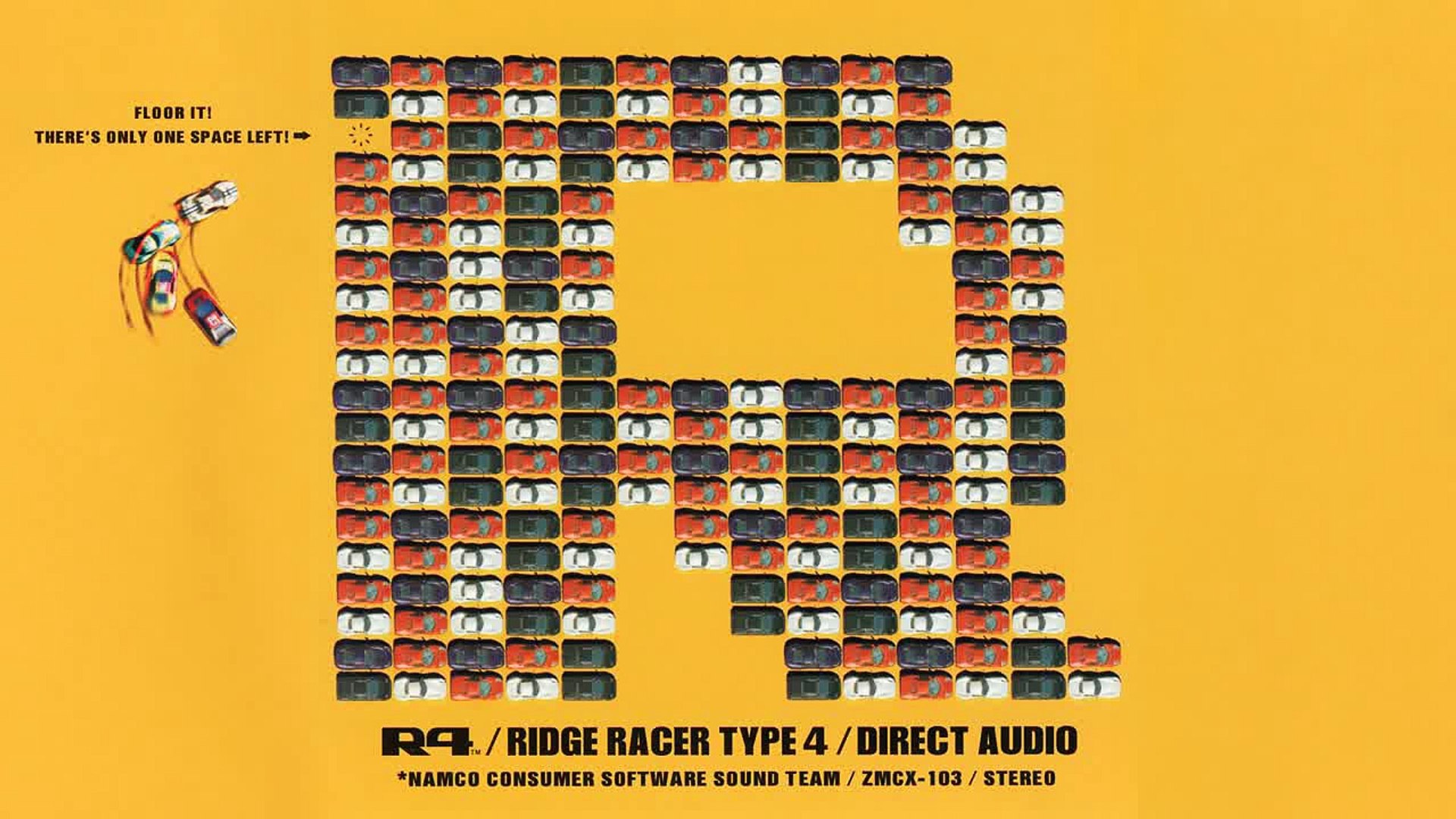
which is the cover art for one of my favorite video game OSTs: Ridge Racer Type 4 - Direct Audio. From looking at the cover, it may not be surprising that, on top of having kickass music, the overall aesthetics of Ridge Racer Type 4 are top notch. In fact, they are kept largely consistent between the album cover as pictured here, the PS1 game art, and the in-game design itself. The classic orange/yellow theme with thick, rounded black lettering influences everything from course illustrations to the portraits of the various “coaches” for each team that you meet throughout the grand prix.
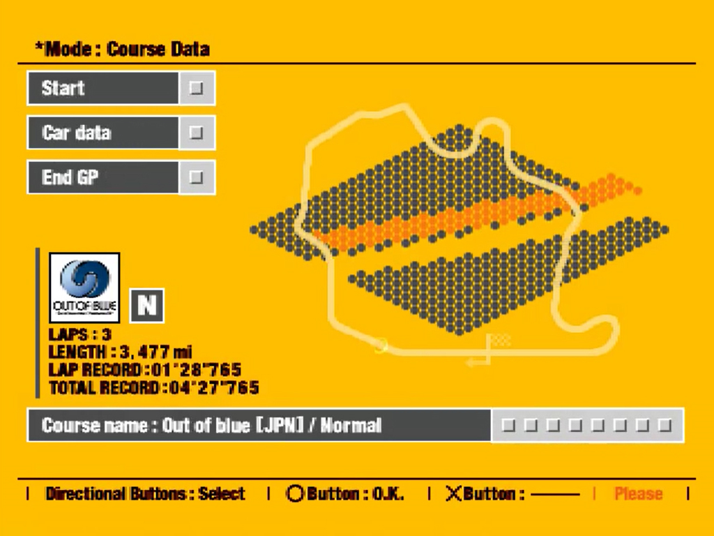



To me, Ridge Racer Type 4 is one of the most stylish games around, and I couldn’t resist a chance to play with some of the assets (which are available on the ridgeracer.fandom page, if anyone is curious about where they came from). After playing around with some ideas, I settled on the final design below.
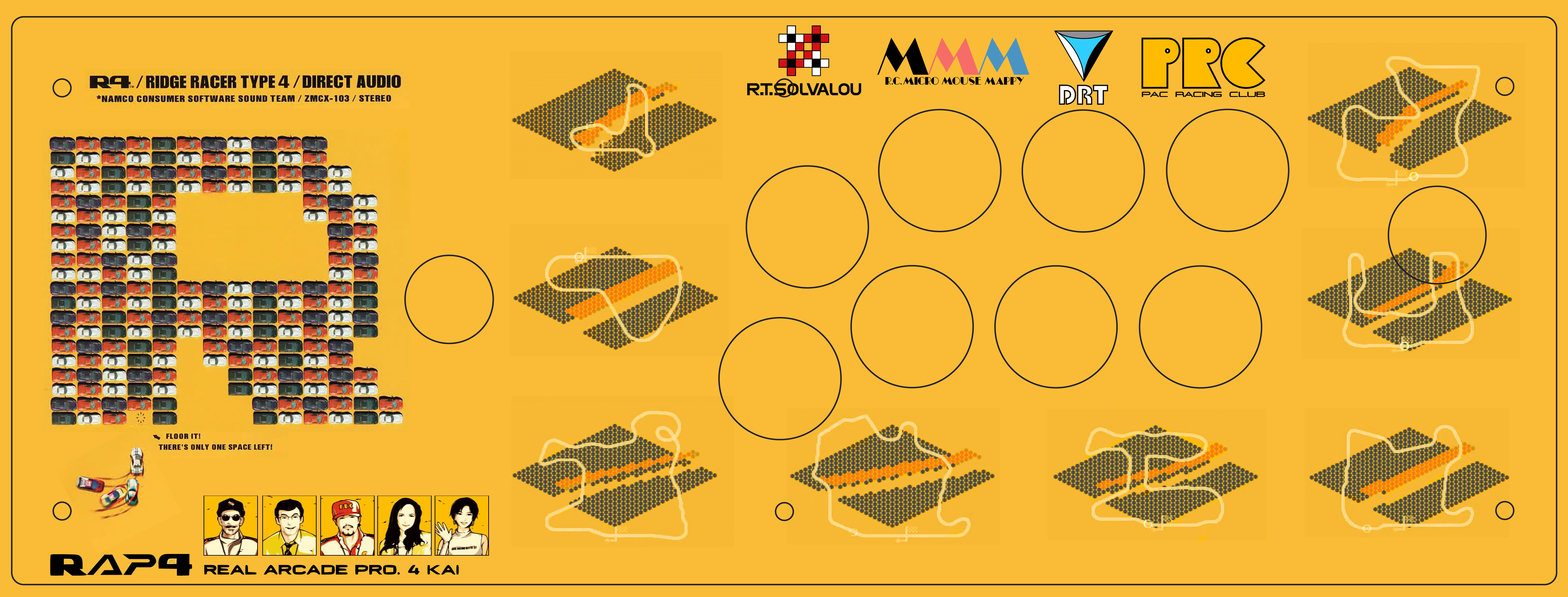
You can see that I made great use of the Ridge Racer Type 4 / Direct Audio album cover, keeping the logos and slightly swapping the location of the “one spot left!” flair. The character portraits also make an appearance here, which complement the “RAP4” style branding that they sit above.
Although I’m far from a competent graphic artist, I am expecially proud of the “RAP4” decal, and the “REAL ARCADE PRO 4 KAI” text next to it. It may not be obvious, but I took the “R” and “4” from the Ridge Racer Type 4 assets and combined them with Hori’s “RAP4” logo. A subtle and somewhat useless effort, but it was too tempting not to do. Overall, the combination of HORI’s arcade stick branding with Ridge Racer Type 4’s style work surprisingly well together.
On the right side of the design, graphics for each track in the game border the button cutouts, along with the logos for each racing team you can choose in the campaign. As I expressed before, all of the game’s assets are amazing, and I wanted to fit as much of it as I could on the design. One minor hiccup with using the track graphics was that they are a slightly different shade of yellow than the main background layer. I tried to clean it up, but if you have a monitor with great color accuracy, the imperfections are likely very visible. If I were to do this over, I would definitely rip my own assets directly from the game to avoid this type of issue at the outset.
I ordered 8+1 Sanwa OBSC buttons (regular + start button)
and a yellow ball top to swap out the
stock parts. I actually quite like the Hayabusa lever, so I decided to
forego replacing it with a Sanwa JLF or Semitsu LS.
I found the parts at Focus Attack, which is a pretty good
option if you are in the US.
I then got to work opening up the stick and installing the buttons.
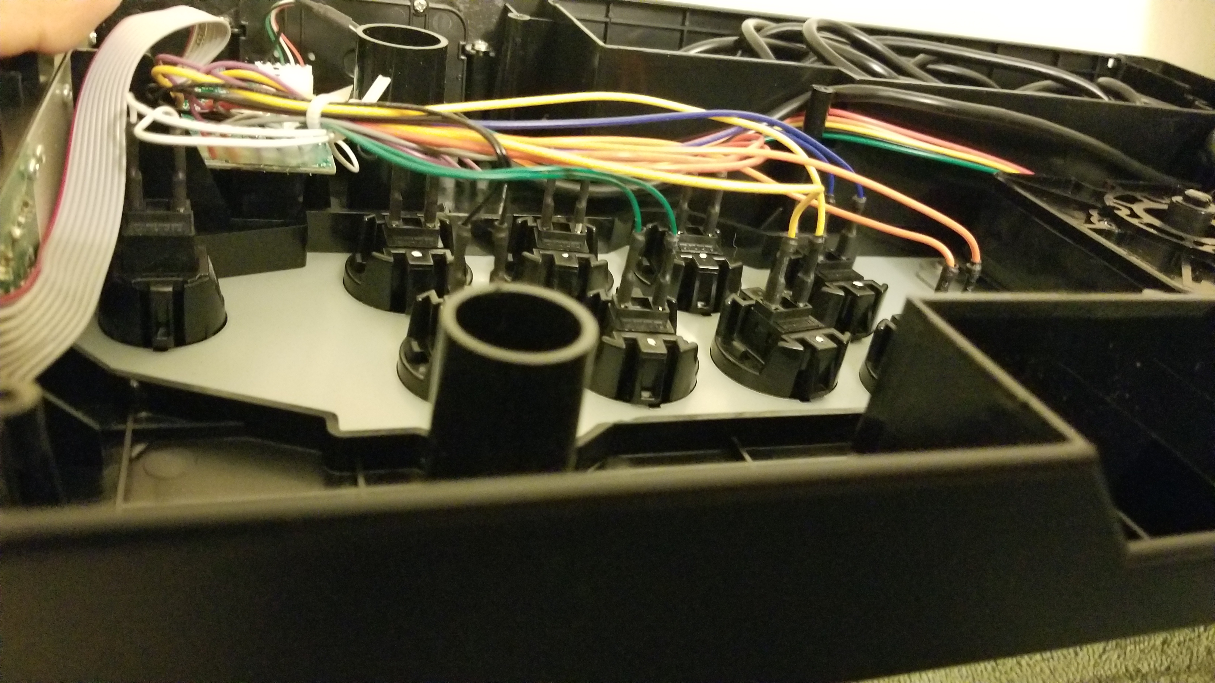
It’s quite a simple process, and requires no special tools/soldering. Installing the artwork was similarly easy, although I did have to take a putty knife to the existing decal to remove it before applying the new print. One thing to note here is that you need to also order a plexiglass cover to keep the artwork safe. I got both of these from Art at tek-innovations, before he moved on to greener pastures. Arcade Shock and Focus Attack should offer the same service, if you are interested in doing it yourself.
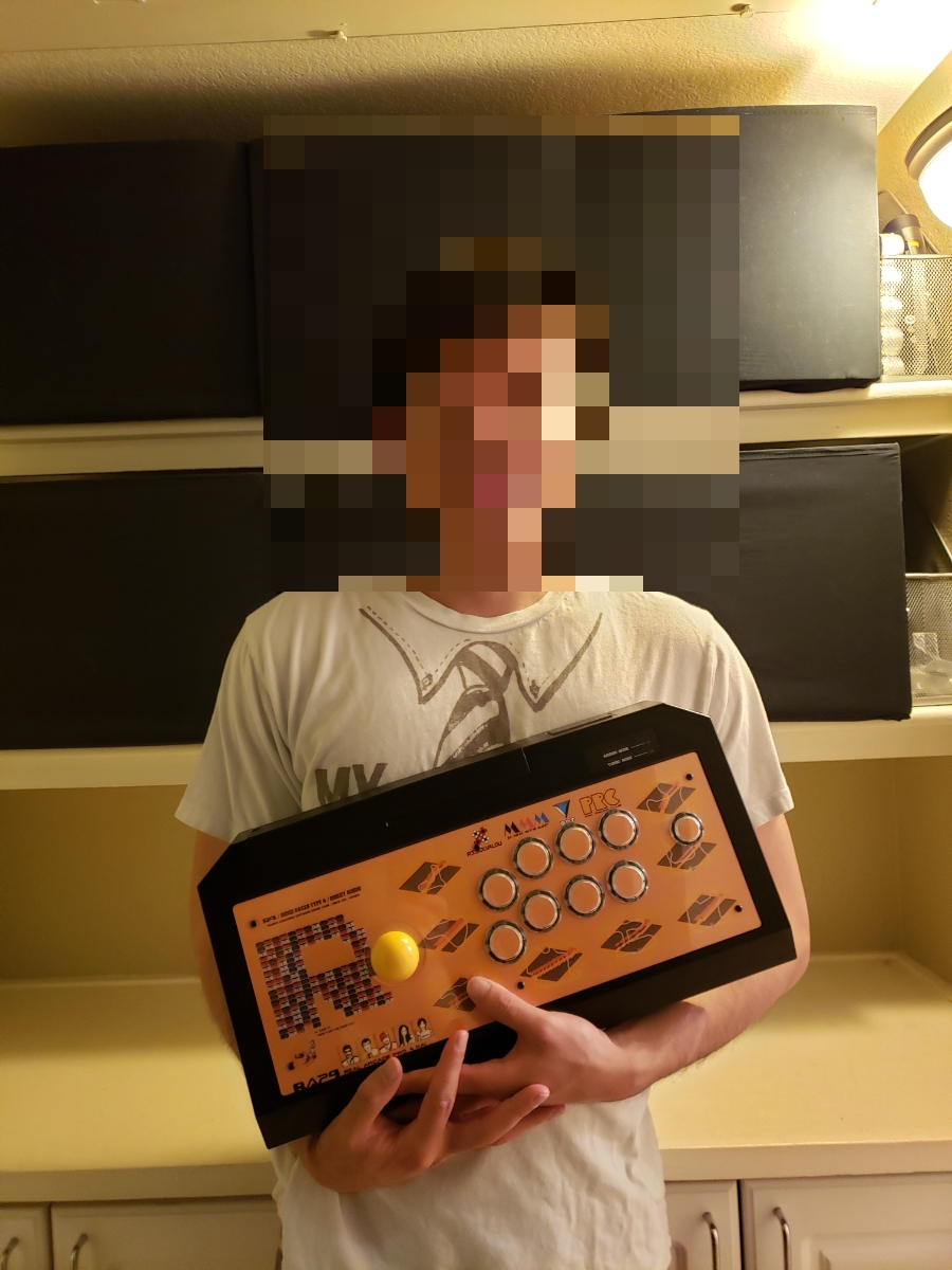
And that’s it! I am really happy with how it turned out, and every time I look at it, I can’t help but be filled with a deep sense of nostalgia for lazy childhood afternoons, arcade racing action, and the quiet curves of Ocean Bay - Yokohama.
April 25th, 2021 by 1regretbeetle